—Do · £100–£500
Designing a Japandi bedroom: the principles, the mistakes, and what to buy first
Hans Wegner designed the Wishbone chair in 1949, and he was copying the Chinese. The CH24, still made by Carl Hansen & Søn, takes its steam-bent top rail and splayed frame almost directly from the Ming-dynasty chairs Wegner had seen in old portraits of Danish merchants who traded with China. He was not referencing “Asia,” that smeared marketing continent. He was looking at a specific tradition of joinery seven centuries old and deciding it had solved a problem better than he could.
That is the fact worth keeping in mind before any of what follows, because it illustrates how the aesthetic now sold as Japandi is not a 2020 invention. Danish design was in direct conversation with a specific East Asian tradition seventy years before anyone stapled the two words together. And the conversation never stopped, or stayed one-directional: more than a quarter of every Wishbone chair Carl Hansen makes today is sold in Japan. A Danish chair, drawn from Ming China, bought in bulk by the Japanese. The portmanteau is new. The dialogue is old, and real, and it is the reason a Japandi bedroom can be more than a moodboard — if you know which parts of it correspond to something true.
What “Japandi” actually names
The word Japandi began appearing in British interiors copy around 2017, and by 2020 it was everywhere — a search term, a Pinterest board, a label a retailer could attach to anything pale and wooden. It is a portmanteau of Japanese and Scandinavian, and it sells a tidy promise: that two of the twentieth century’s most disciplined design cultures can be had as a single mood, assembled from a shopping list of blonde wood, a branch in a stoneware vase, and undyed linen.
It is an awkward coinage, and it welds together two distinct traditions with different histories and different reasons for looking the way they do. One of the two — the wabi-sabi strain usually invoked for the Japanese half — is a philosophy that gets fatally flattened the moment it is treated solely as a look.
The conversation the word names is genuine, and unusually old. The traffic between Danish and Japanese design runs back about 150 years, to the moment Japan opened its borders after more than two centuries of near-total seclusion. A visiting Danish naval officer, William Carstensen, wrote a best-selling account of the country, and the fascination he kindled never quite faded. What the shared DNA amounts to is specific: restraint, material honesty, visible craft, low and warm light, and function placed ahead of ornament. Those five things are real, durable, and the exact opposite of status-driven maximalism. So this is not a guide to a trend. It is a guide to which parts of “Japandi” point at something true — and, because you have a room to build, the order in which to spend on them. The floor of that argument, in rug form, is the companion piece on why Japandi flooring should be wool and not jute.
The five principles that matter
Restraint is subtraction, not a palette. The most common misreading of Japandi is that it is a colour scheme — greige walls, a beige throw, and you are done. It is not a palette; it is an amount. Empty space is the material you are working with, and a near-bare wall is a decision rather than a gap waiting to be filled. Getting this right costs nothing and is the single hardest instruction to follow, because it asks you to stop buying. Greige paint is not a philosophy. Leaving one wall with nothing on it is closer to the actual idea than any object you could hang there.
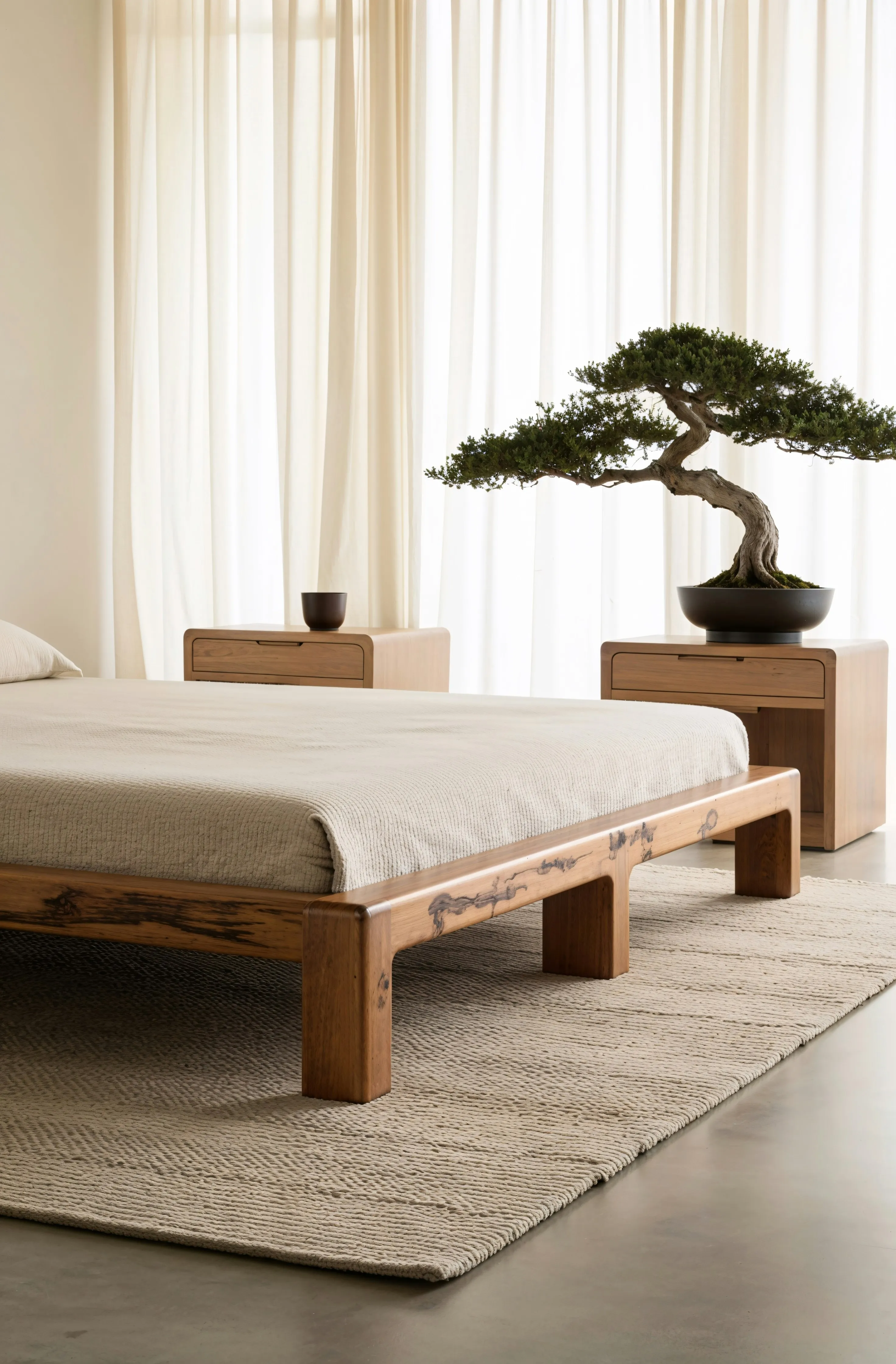
Keep the centre of gravity low. Traditional Japanese interiors are organised near the floor — the futon laid on tatami and folded away by day, low tables, cushions rather than chairs — so the whole horizontal sightline of a room sits low. A low platform bed imports that logic directly. It is the largest single mass in a bedroom and the object your body meets most, and dropping it closer to the floor changes the perceived height and quiet of a room more than any accessory will. The bed is the horizon line. Everything else is measured against it, which is also why it is the first thing you buy.
Material honesty, and the mark of use. Wood that shows its grain rather than a printed photograph of grain; linen that creases; ceramics with real tonal variation from the kiln. The crucial qualifier — the one that separates this from its catalogue imitation — is that the variation has to be earned, not manufactured. A glaze that varies because it reacted in a real firing is honest; a matching set sold as pre-distressed is a simulacrum of honesty. That distinction runs through the whole of our ceramics guide, and it is the hinge the mistakes below turn on.
Warm light, low and dim. Use a 2,700K bulb. Not “warm-toned,” not “soft white” — 2,700K, which is the number printed on the box, and never the bluish 4,000K that makes a bedroom read like a bathroom. Put it on more than one low source — a lamp beside the bed, a second on a chest or the floor — and never rely on a single cool fitting in the middle of the ceiling, which flattens a room and kills every shadow that gave it depth. This is the cheapest transformation available and the one most often skipped.
One old thing anchors the room. A single secondhand or inherited object — a worn wooden stool, a piece of studio pottery with thirty years on it, a small painting — carries the patina that everything else in the room can only imitate. It is the principle that resists the shopping list hardest, because you cannot add it to a basket in a coordinated colourway, and it is the one to close on. Hold that thought; it is where the piece ends and where the whole method is decided.
The mistakes that cost money for nothing
Buying new “imperfection.” This is the signature failure, and it is the wabi-sabi argument applied to one room. You cannot purchase patina in coordinated units. A matching set of artfully-wonky stoneware, a factory-distressed oak chest, a “handcrafted” lamp base made ten thousand at a time — each is selling you the appearance of age and use without the age or the use. The variation is applied at the factory, identically, which is the precise opposite of what makes a genuinely old object worth having. Spend the money instead on fewer things that will actually acquire a history, or on one thing that already has one.
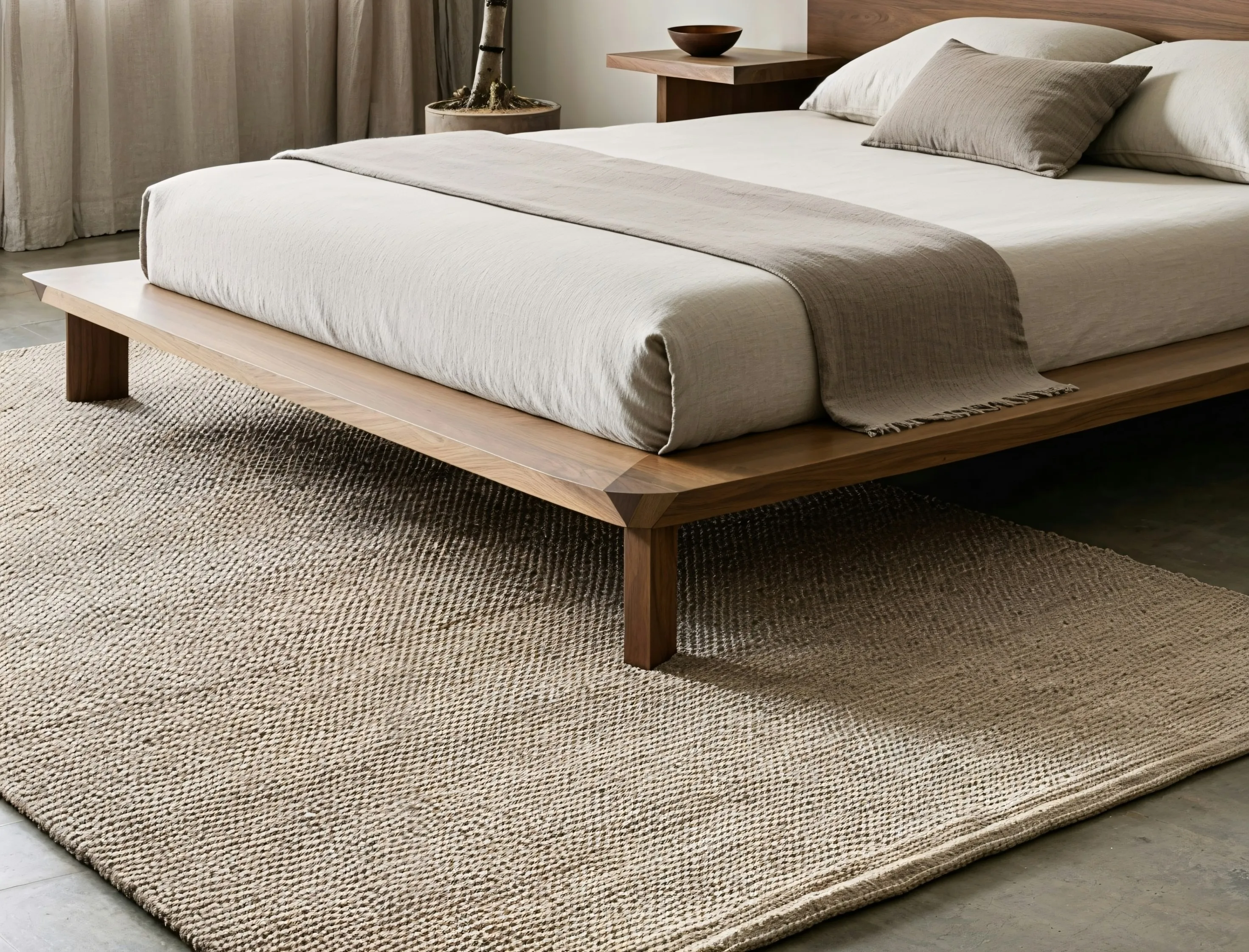
Choosing materials for the photograph, not the floor. Jute reads “Japandi” and photographs raw and honest, and it is the wrong thing under a bed you meet barefoot at seven in the morning, because it is coarse underfoot and sheds. This is the jute-versus-wool argument from our rugs guide, transposed to a room you are barefoot in more than any other. Linen bedding is the material that survives this test: it earns its place not because it looks unbleached on Pinterest but because it thermoregulates — cool in summer, warm in winter — and because it softens with washing rather than pilling. Choose for the body first and the camera second, and the two usually end up agreeing anyway.
Treating greige as a philosophy. A room painted the colour of oat milk is not restrained; it is just beige. Restraint is about how many things are in the room and how much space is left between them, not about draining the colour out of everything. A single deep, warm wall or a genuinely black object can do more for the discipline of a room than another tin of taupe.
Cool-white bulbs killing all of it. You can do everything else right and undo the entire room with one 5,000K bulb. It is worth repeating because it is that common: 2,700K, dimmable, more than one source, never a lone cool ceiling light.
What to buy first — the spend order
The method is the same as our £3,000 living-room guide: concentrate the money on the objects you are in physical contact with most, and let everything else stand down. In a bedroom that ranking is unambiguous. You are in contact with the bed and the bedding for eight hours a night; with the light every evening; with a decorative object essentially never. So you buy them in that order, and you spend in that order too.
1 · The bed frame. Buy this first and give it the largest share. The low platform bed is the room’s horizon line, its biggest mass, and the most Japandi-defining single object you will own — get it right and the room is most of the way there before anything else arrives. Muji’s oak platform bed, at £479 for the double, is the obvious reference point and a genuinely good object: solid oak, low, no headboard drama, nothing to it but the wood and the proportion. Get Laid Beds run a competitively priced range of low rise beds, in a variety of finishes, that also do a robust job here. Heal’s and Cox & Cox all carry low wooden frames in the same register if your budget allows a jump up the desirability ladder. Whatever you choose, the rule is low and plain; the frame should read as a horizontal line, not a piece of furniture asking for attention. One note on the mattress it holds: buy it well, because it is the highest-contact object in the house — but buy it on its own merits.
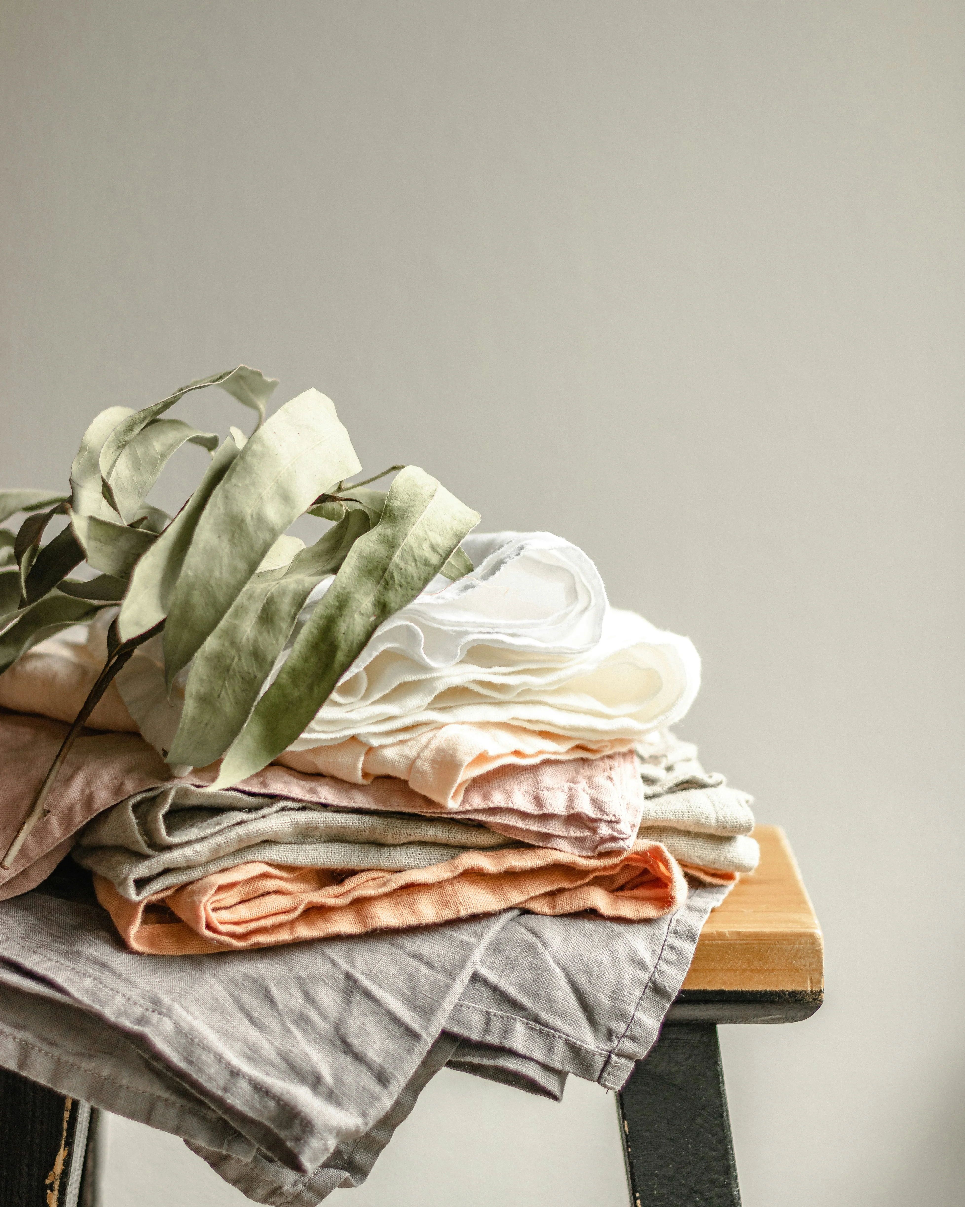
2 · The bedding. Linen, and here the adjective is earned rather than decorative. Linen thermoregulates in a way cotton does not, and it ages by softening rather than pilling or thinning, which means the set you buy improves for years instead of degrading. Secret Linen Store is the pick — a 100% linen duvet cover runs from around £100 and a full set nearer £180, and the company is a certified B Corp. Buy undyed or a muted, low-saturation colour, and let it crease. The creasing is the material telling the truth; ironing it flat is arguing with the entire point.
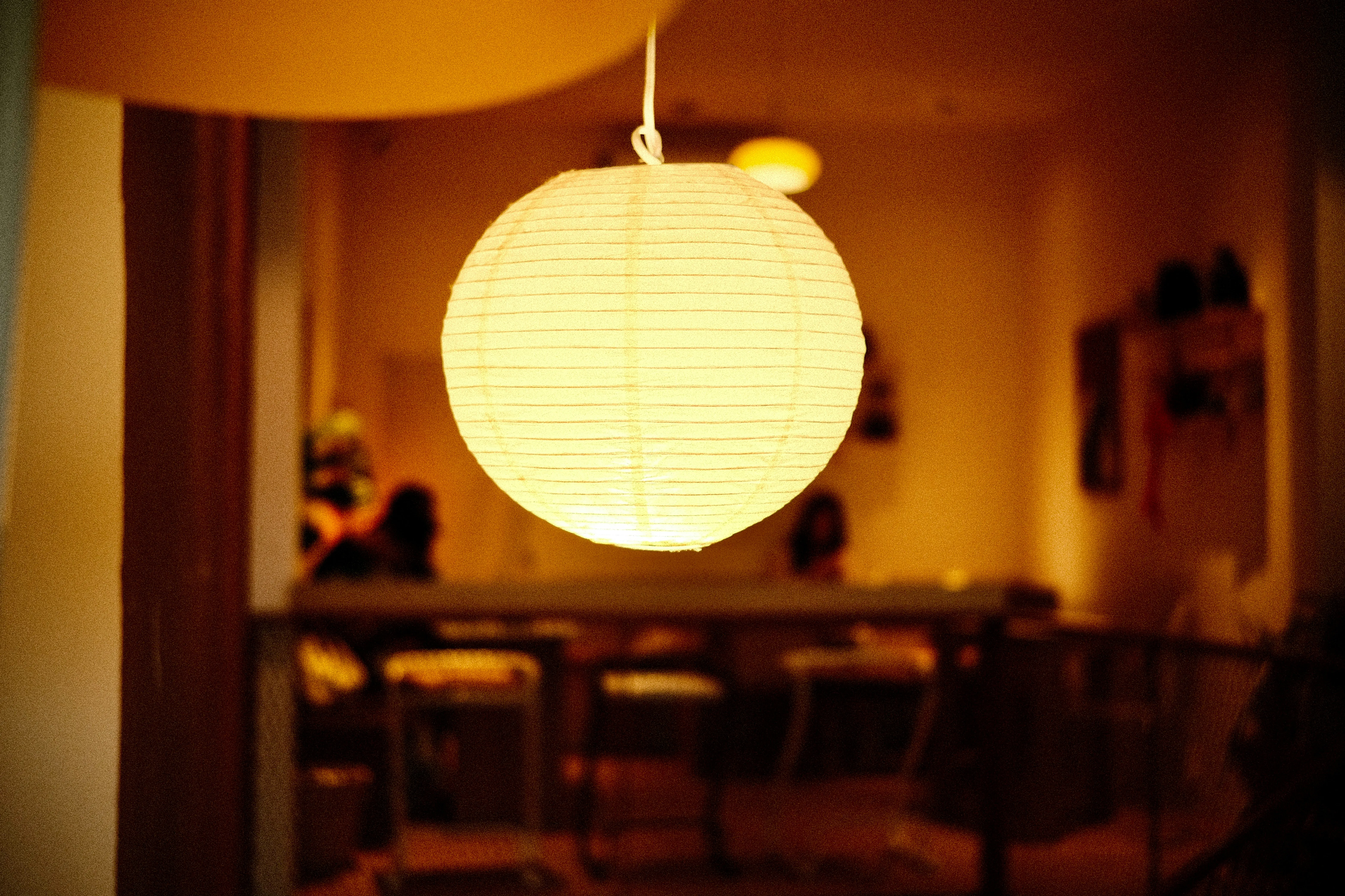
3 · The lighting. Low, warm, dimmable, and more than one source. The natural cultural reference here is the Noguchi Akari lamp — the washi-paper lanterns Isamu Noguchi began making in 1951, designed on the argument that the diffused light of a paper lantern is physiologically calmer than the hard shadow of an opaque shade. The Akari is worth knowing and, in original form, worth more than most bedrooms’ whole lighting budget. The buyable version of the same idea is the Carta rice paper lamp from Heal’s at £189, which does the paper-lantern job honestly rather than as pastiche; the floor-lamp guide makes the full case for it. Stand it beside the low bed, add a small second source on a chest, put 2,700K bulbs in both, and keep them off any circuit that also runs an overhead.
4 · One decorative piece — ideally secondhand. This is the slot where the wabi-sabi trap is closed rather than fallen into, and it is deliberately the last and smallest spend. The best version of this object is old: Vinterior is the place to look for a single secondhand piece — a small ceramic, a wooden object, a worn stool — that arrives already carrying the history the rest of the room is imitating. If you would rather buy new, keep it to one considered object from Nkuku, or a single piece of studio pottery chosen on the terms set out in the ceramics guide — not a matched set. One or two pieces, no more. This is not a shelf to fill; it is the one exception you allow yourself, and it does the most work when it is the only one.
The floor, briefly
The rug is one line, not a section: buy wool, not jute, for a floor you meet barefoot at seven in the morning. Jute photographs raw and honest and feels like a doormat under a bare foot; wool gives the same visual restraint with warmth you actually register at waking. The rugs guide has the full argument and the specific picks, and it applies to a bedroom more than to any other room in the house, because a bedroom is the one you stand in with nothing on your feet.
So: buy the bed, then the bedding, then the light, and stop before the room is full. Then find the one old thing — the stool that was somebody’s, the bowl with a real decade of use on it, the object you did not buy new — and let it be the exception in a room that is otherwise restrained on purpose. That single piece of unbought patina is the part of “Japandi” that was never for sale in the first place, and it is the part that decides whether the room reads as considered or merely shopped.