—Decide · £29–£565
What a Japandi rug is actually for (and why to buy wool, not jute)
The word “Japandi” began appearing in British interiors copy around 2017, and by 2020 it was everywhere — a search term, a Pinterest board, a label retailers could attach to anything pale and wooden. It is a portmanteau of Japanese and Scandinavian, and it sells a tidy promise: that two of the twentieth century’s most disciplined design cultures can be had as a single mood, assembled from a shopping list of blonde wood, a branch in a stoneware vase, and a jute rug.
The term is new. The conversation it names is not. The traffic between Danish and Japanese design runs back about 150 years, to the moment Japan opened its borders after more than two centuries of near-total seclusion. As Nicolina Olsen-Rule of Design Museum Denmark tells it, a visiting Danish naval officer, William Carstensen, wrote a best-selling account of the country’s culture and its shops, and the fascination he kindled never quite faded; the museum in Copenhagen now keeps a standing collection devoted to the two nations’ long history of trade and friendship. What a 2017 hashtag compresses into a mood is, in other words, a genuine and unusually old exchange between two traditions that recognised something in each other.
That history is worth holding onto, because the shorthand tends to mislay it. Sold as a mood, the affinity becomes a set of props — and the rug, the prop at the top of every list, is where the shorthand quietly costs you money. The two traditions did share a great deal. But what they shared was an idea, not a fibre, and the idea is not the thing on offer at a floor-covering retailer. Understand what the affinity actually is, and the rug you should buy changes.
The term, interrogated
The trouble with the label is that it lets you skip the part that matters. It takes two traditions that each spent decades arriving at restraint and treats the restraint as a starting point — a look to assemble rather than a conclusion someone reached. A real Japanese interior and a real Scandinavian one do not look the same, and the differences are where it gets interesting. A Danish living room is warm by instinct: it is dark and cold outside for much of the year, so the design turns inward, toward wood, wool and lamplight — hygge, the Danish idea of warmth and wellbeing in the home, is a design philosophy before it was ever a marketing one. A traditional Japanese room is spare by philosophy: the emptiness is the content, the tatami and shoji doing deliberate work that Western rooms hand to furniture.
Flatten those into one beige scheme and you lose both. You get the surface of each and the substance of neither — which is precisely what most “Japandi” merchandise is selling. The label is not useless, but it is a suggestion to stop looking at the exact moment looking gets rewarding.
What they share, and how differently they get there
Strip back the styling and the two traditions do converge, on four things: minimalism, craftsmanship, the beauty of useful objects, and an honesty about materials. What is worth understanding is that they reach those four by genuinely different roads.
Take craftsmanship and utility. In Japan, the relevant movement is mingei — the folk-craft philosophy articulated by Sōetsu Yanagi from the mid-1920s, which held that the truest beauty lived in unsigned, handmade objects made for daily use: a rice bowl, a length of cloth. Beauty was a by-product of function honestly served, not a goal pursued for its own sake. Scandinavia arrived at a strikingly similar place from the opposite direction — through functionalism, the rationalist conviction that a well-designed everyday object should be available to everyone, which ran from Kaare Klint’s furniture teaching in 1920s Copenhagen through to the whole post-war Danish Modern project. One route is spiritual and rooted in folk tradition; the other is rationalist and quasi-political. They meet at the same chair.
Or take the relationship to nature and material. The Japanese thread is wabi-sabi: a worldview that finds beauty in impermanence, asymmetry, and the marks of age — the glaze that pools unevenly, the timber that silvers. The Scandinavian thread is a plainer naturalism born of climate and proximity: bring the wood, the wool, and the daylight indoors because the winter is long and the forest is close. Both refuse to hide what a thing is made of. One refuses it as a meditation on transience; the other as a matter of common sense. Same honesty, different reason.
This is why the convergence is more than a coincidence of palette, and why a rug that genuinely draws on both can be more than a beige compromise. It is also why the styling-led version is so thin: it copies the meeting point without any of the roads that lead there.
So what is a “Japandi rug,” then?
Having refused the lazy definition, here is a usable one. A rug that works in this register has three properties, and none of them is a pattern.
First, a natural or natural-looking fibre — wool, cotton, or the jute and sisal family — because the material honesty described above is the whole point, and a synthetic pile reads as exactly what it is. Second, a warm neutral rather than a cool one: oatmeal, undyed cream, sand, the colour of unbleached wool — not the cool greys that defined the previous decade’s minimalism. The temperature of the neutral is what separates this from the chilly end of Scandinavian modernism. Third, restraint over pattern. Where another tradition would use a motif, this one uses texture: a loop-and-cut pile, a flatweave, a hand-braided surface that catches light differently as you cross the room. The visual interest is built into the construction, not printed on top.
That is the definition. Notice that it says nothing about jute specifically — and that omission is the argument.
Why the rug matters more than you think
After the sofa and the wall colour, nothing changes a room as much as the rug, and most people treat it as the last decision rather than a structural one. Three things are worth getting right, in order of how expensive they are to fix.
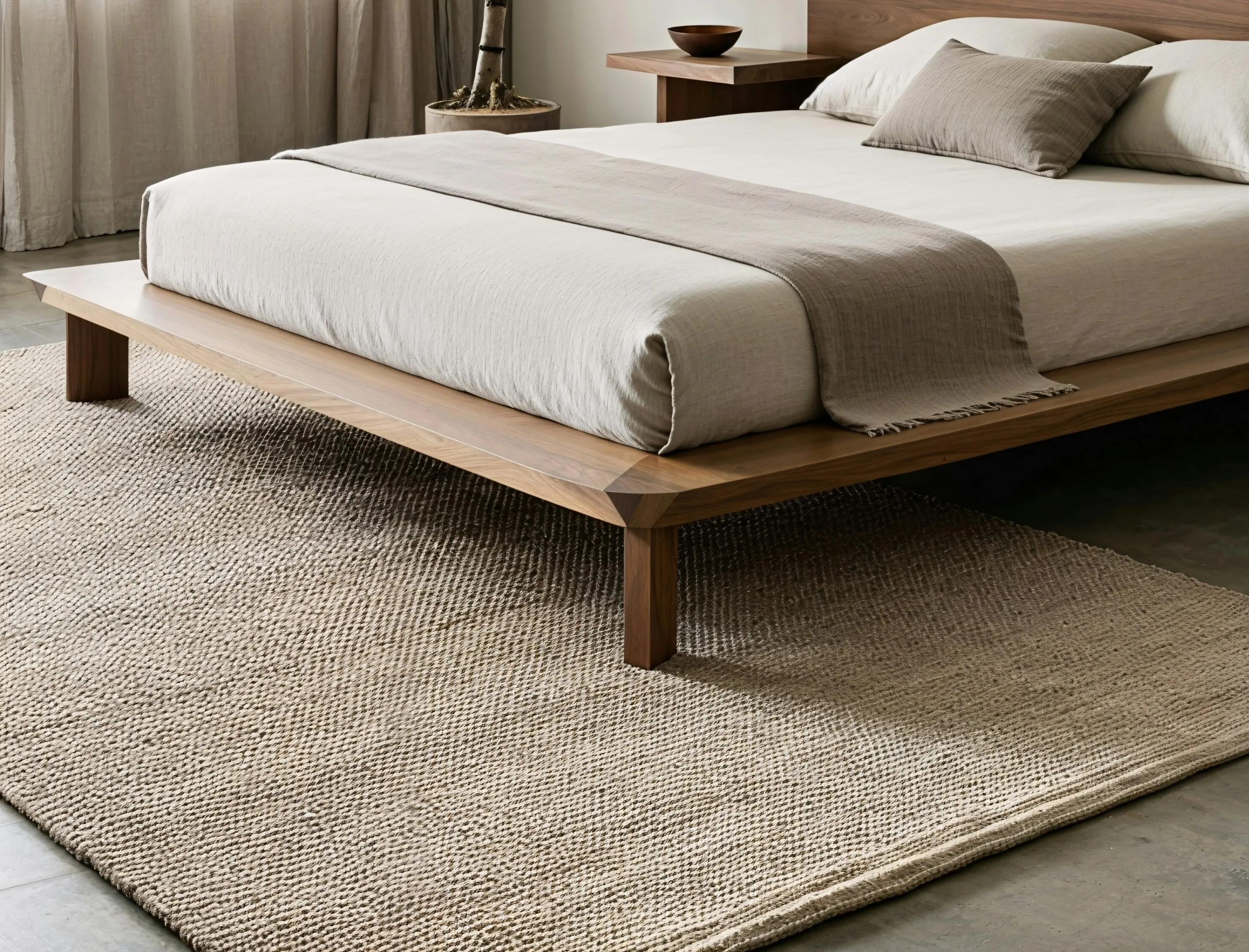
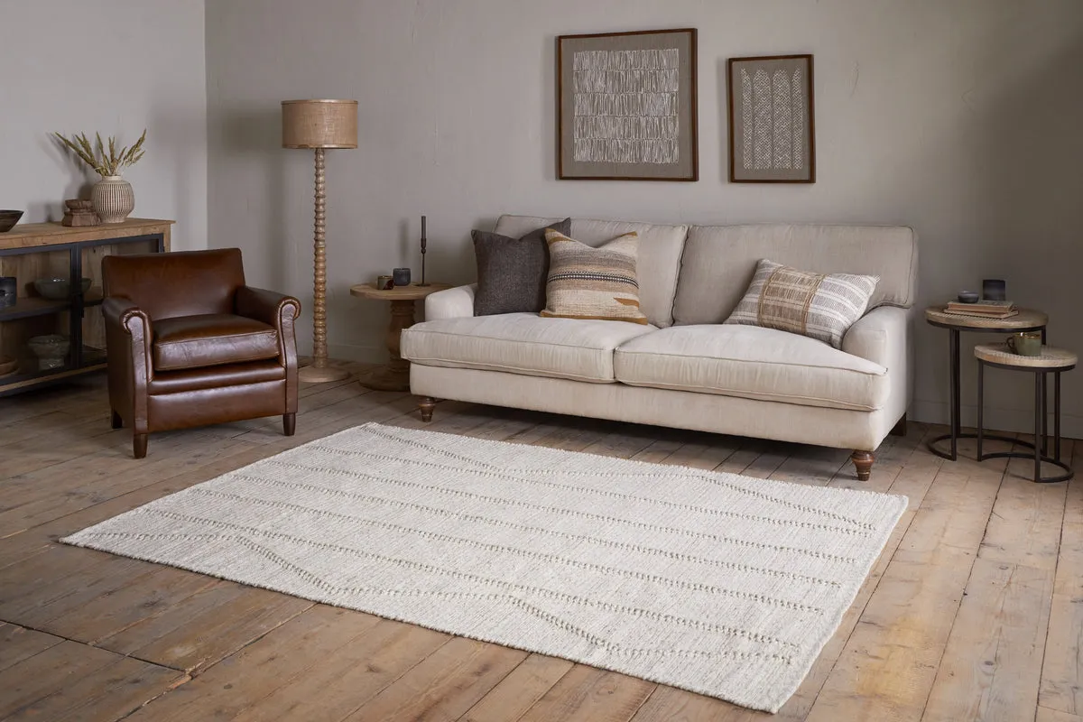
Sizing is the commonest and costliest mistake. A rug that is too small makes a room look smaller, not larger — it reads as a mat marooned in the middle of the floor, and it visually shrinks everything around it. The reliable rule is that the front legs of the sofa and the main chairs should sit on the rug, not float in front of it; the rug should anchor the furniture into a group rather than hide beneath the coffee table. This almost always means buying a size up from the one that feels intuitively right, which is why the picks below quote room-scale sizes, not the small ones that make the headline price look better.
Then composition and colour temperature. Because the palette is restrained, the rug is carrying tone and texture for the whole room — it is not an accent, it is the floor of the argument. A warm-neutral wool under warm wood does quiet, continuous work; a cool grey synthetic fights everything above it. Get the size and the temperature right and the rug disappears into rightness. Get them wrong and no amount of styling above it will recover the room.
The picks
Six rugs, tiered by price. The verdict first, because the brief of this piece is a decision: buy the Cox & Cox Agna at £225. It is hand-braided wool-and-cotton that delivers the texture people actually want from jute without the scratch, in a warm natural, at a price that proves the point of the whole article — the look is restraint and palette, not spend. Everything below it explains why; everything above it is optional refinement, not correction.
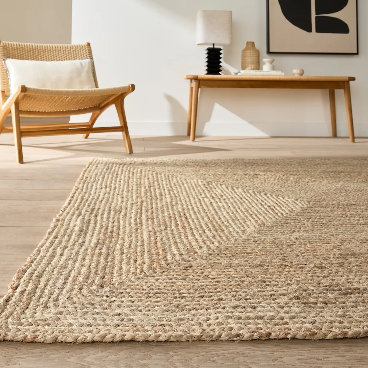
The handsome, honest budget jute, and a useful object as long as you know its limits — which, to their credit, La Redoute state plainly: it sheds, and it is for low-traffic areas only. Jute is photogenic; its loose, ropey texture is exactly what the Pinterest version of this look is selling. But it is coarse underfoot, it does not take kindly to a living room’s daily traffic, and it gives up its fibres for months. From £29 for a runner and around £99 for a room size, it is a fine layer for a hallway or under a console. It is not the centre of a room you actually live in, which is the one place most guides put it.
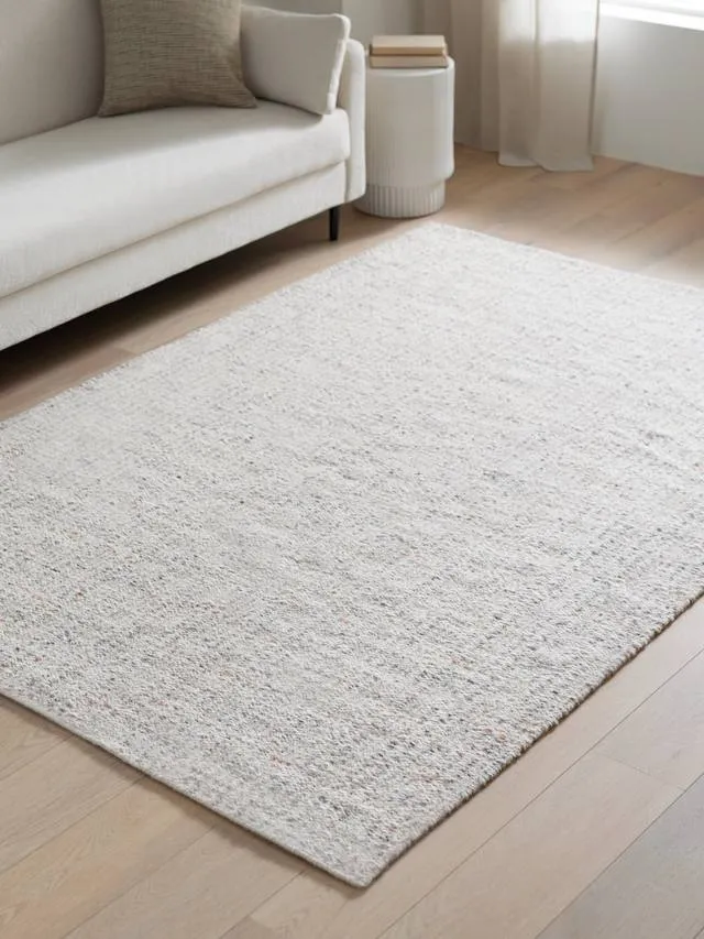
This is the cheapest way into the right answer. At £125 — barely more than a good jute in a room size — the Rowan is wool-rich, in a warm natural, with texture standing in for pattern and almost none of the shedding or scratch. The surprise of this whole category is how little proper wool actually costs, and the Rowan is the proof: spend the extra £25 over the jute and you get the warmth and near-flatness the look genuinely wants. For a reader who wants to spend as little as possible without buying the wrong thing, this is the floor.
Recommended pick
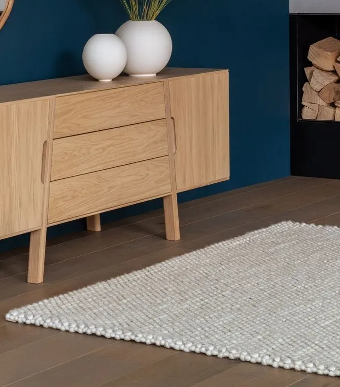
The recommended buy. The Agna is hand-braided wool-and-cotton, and what it does is precise: it answers jute’s only real appeal — that chunky, textured surface — in wool, without the coarseness or the shedding. The braid gives a surface with genuine depth, the warm natural sits correctly under wood, and at £225 in a room size it lands inside almost any furnishing budget. This is the rug that makes the argument concrete: you do not need to spend more to get the look right, you need to spend on the right fibre. On the argument and in the budget, which is exactly why it is the recommendation.
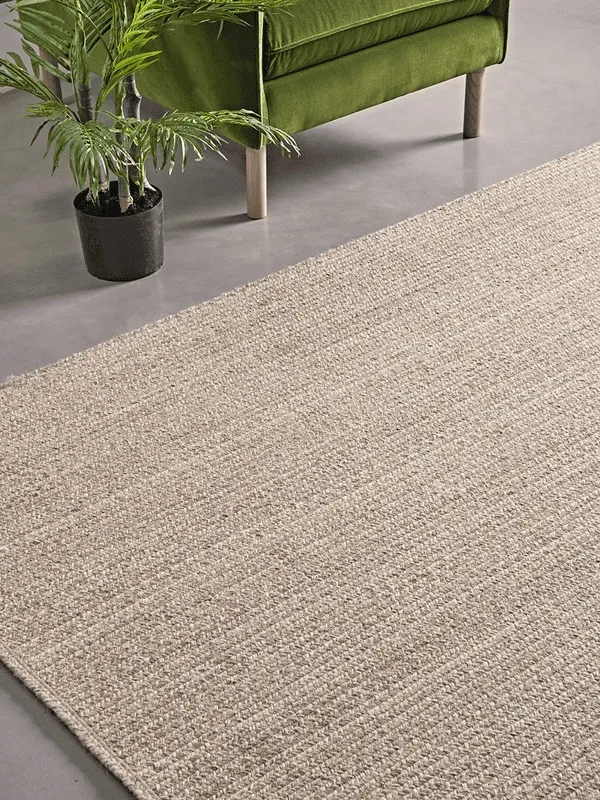
Denser and lower than the Agna, artisan-made, and sitting squarely in the natural-materials ethos the whole piece is built on. At £400 the Shanti is the more considered object — a tighter, flatter weave that feels substantial underfoot — and the extra £175 over the Agna buys density and a maker’s story rather than a different look. Worth it if the provenance matters to you; not necessary to get the room right.
Felted New Zealand wool with a viscose blend that cuts the shedding and soft cotton in the build — a design-house rug that is a refinement of the Agna’s idea, not a correction of it. At £565 you are buying longevity and finish: the kind of construction that outlasts the sofa it sits under. The look is not better than the Agna’s; the rug simply lasts longer and feels more resolved. Spend it if you are furnishing once and want the floor to be the last thing you replace.
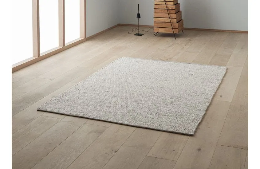
The most restrained pick here, and the natural top end of this register: 100% pure wool, hand-woven by a Danish design house, in a plain neutral mélange that reads as a single colour across the room and reveals subtle tonal shifts up close. From £450, with living-room sizes past £500, the Agner is what this look becomes when it is done with no compromises at all — texture and tone doing everything, pattern doing nothing. If the Agna is the argument proven, the Agner is the argument at its most expensive and most disciplined.
The jump you will actually feel is the one from jute to wool; above roughly £250 you are buying longevity and finish, not a different room. Which is the whole point, and the thing the label obscures. “Japandi” sold you a fibre because a fibre is easy to photograph and easy to ship. But the two traditions it borrows from never agreed on a material — they agreed on restraint, on warmth, on letting an honest surface do quiet work. The look was never in the jute. It was never in any single thing you could add to a basket. Buy the wool, buy it bigger than feels natural, and let it disappear into the room. That is the part no shopping list can sell you.
The Grain earns commission on some links in this piece. It accepts no paid placements. See also the mid-century sofa guide — after the sofa, the rug is the next decision — and what mid-century modernism was actually for.